There is a quality that separates rooms that feel alive from rooms that merely look correct. It is not colour. It is not size. It is not the presence of expensive objects. It is texture — the layered presence of different tactile surfaces that gives a room depth, warmth, and the quality that makes you want to be in it rather than simply observe it from the door.
In 2026, texture has become the primary design language of considered interiors. As palettes grow quieter and more restrained, surfaces must do the work that colour once did. A room of warm neutrals with no textural variation is flat; the same palette with five distinct tactile surfaces is extraordinary.
Why Texture Works Where Colour Cannot
Colour is perceived primarily visually and responds to light in ways that change through the day but remain essentially consistent. Texture is perceived both visually and physically — it activates the sense of touch even when you are not touching it, because the brain simulates the experience of what the eye reads. A rough stone wall, seen from across a room, produces a different physical response than a smooth painted wall, even at the same distance.
This is why textured surfaces contribute to the way a room feels to be in rather than simply how it looks. A room with varied textures — rough, smooth, soft, hard, matte, reflective — produces a more complex and satisfying sensory experience than a room with visual variety but uniform texture. The eye has more to explore; the body responds to the promise of different tactile qualities even unprompted.
When designers talk about a room that “photographs well but doesn’t feel right,” they are almost always describing a room with strong visual composition but insufficient textural depth.
The Grounding Layer: Start at the Floor
Every textural composition begins at the floor. The floor texture establishes the base note — the material against which everything above it is read. A polished concrete floor sets a different register than a wide-plank oak floor, which is different again from a natural fibre rug laid over stone tiles.
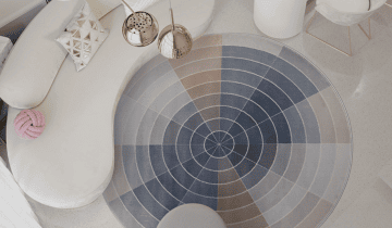
The rug is the single most powerful textural intervention in a living space. It defines the zone, warms the room acoustically and physically, and provides the first layer of contrast with the floor beneath it. For maximum effect, choose a rug texture that contrasts with the floor rather than matching it: a soft, deep-pile wool rug over smooth stone; a flat-woven jute over warm timber boards; a heavily textured natural fibre over a smooth concrete surface.
Layering rugs — a natural fibre rug as the base with a smaller, softer rug on top — is a technique that adds depth and warmth without changing the overall palette. It works particularly well in sitting rooms where a jute or sisal base benefits from the softness of a wool or cotton layer in the zone immediately in front of the sofa.
The Wall: The Most Underused Surface
Most walls in most rooms are painted smooth — a decision made by default rather than intention. The return of treated wall surfaces in 2026 is a direct response to the visual and tactile poverty of the flat-painted room.
Limewash is the most accessible entry point: it can be applied over existing plaster by a skilled painter in a single day, and the result — a surface with depth, variation, and the quality of movement that comes from a material that absorbs and reflects light differently across its surface — is immediately apparent. The colour of a limewashed wall changes through the day, which is precisely what gives it its vitality.
Natural plaster, applied by hand, goes further. The slight undulations of hand application produce a surface that catches raking light in a way that is impossible to replicate with spray or roller finishes. Applied to an accent wall behind a bed or sofa, it creates a textural anchor for the whole room.
Wood panelling — applied as horizontal boards, vertical tongue-and-groove, or geometric Shaker panels — adds both textural interest and architectural definition to a room that lacks inherent detail. It is worth considering for any flat-walled room that needs warmth and structure without major building work.
Textiles as a System
Cushions, throws, and curtains are the most flexible textural elements in any room — they can be changed seasonally, adjusted to the light, and edited without commitment. But they work best when they are treated as a system rather than as individual purchases.
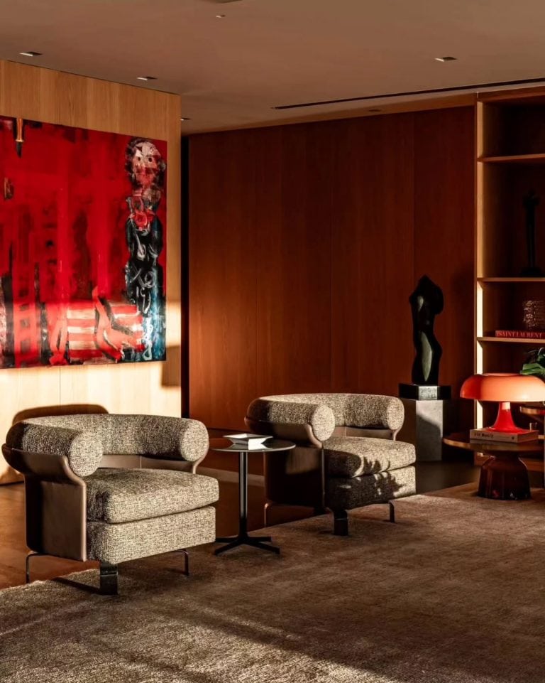
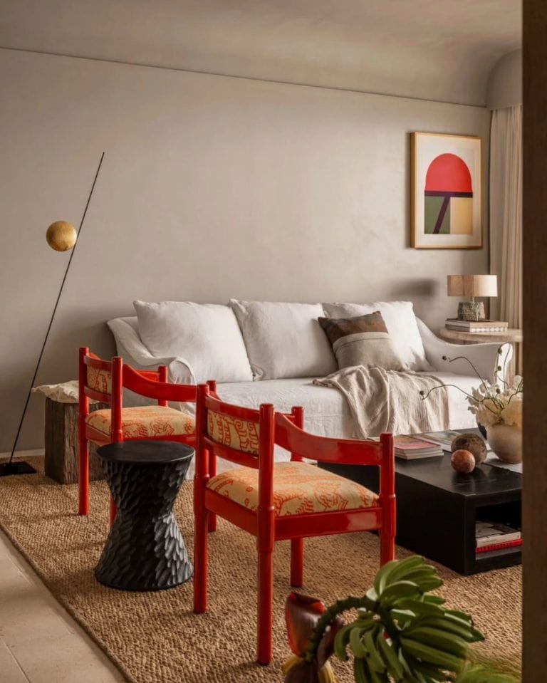
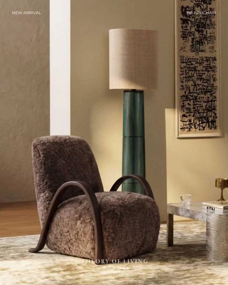
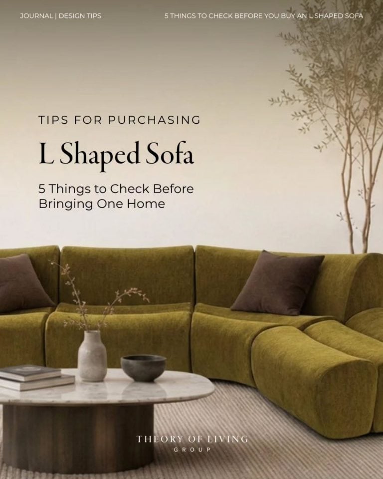
A useful principle: choose three textile textures that complement rather than match. In a living room, this might be a heavyweight linen on the sofa, a bouclé on the lounge chair, and a chunky knit throw draped at the end of the sofa. The linen is tight and flat; the bouclé is looped and nubby; the knit is open and dimensional. Three textures, one palette. This produces richness without visual noise.
Curtains are a textural element as much as a light-management tool. In 2026, the preference is for floor-to-ceiling linen curtains in a colour close to the wall — which adds texture and movement without strong contrast, and makes the room feel larger by extending the vertical line of the wall.
Hard and Soft: The Balance That Resolves a Room
The fundamental tension in textural layering is between hard and soft surfaces — between the warmth of textiles and the grounding weight of stone, wood, and metal. A room composed entirely of soft surfaces feels unsettled; a room of entirely hard surfaces feels cold. The resolution is contrast — and the specific ratio depends on the room’s purpose and orientation.
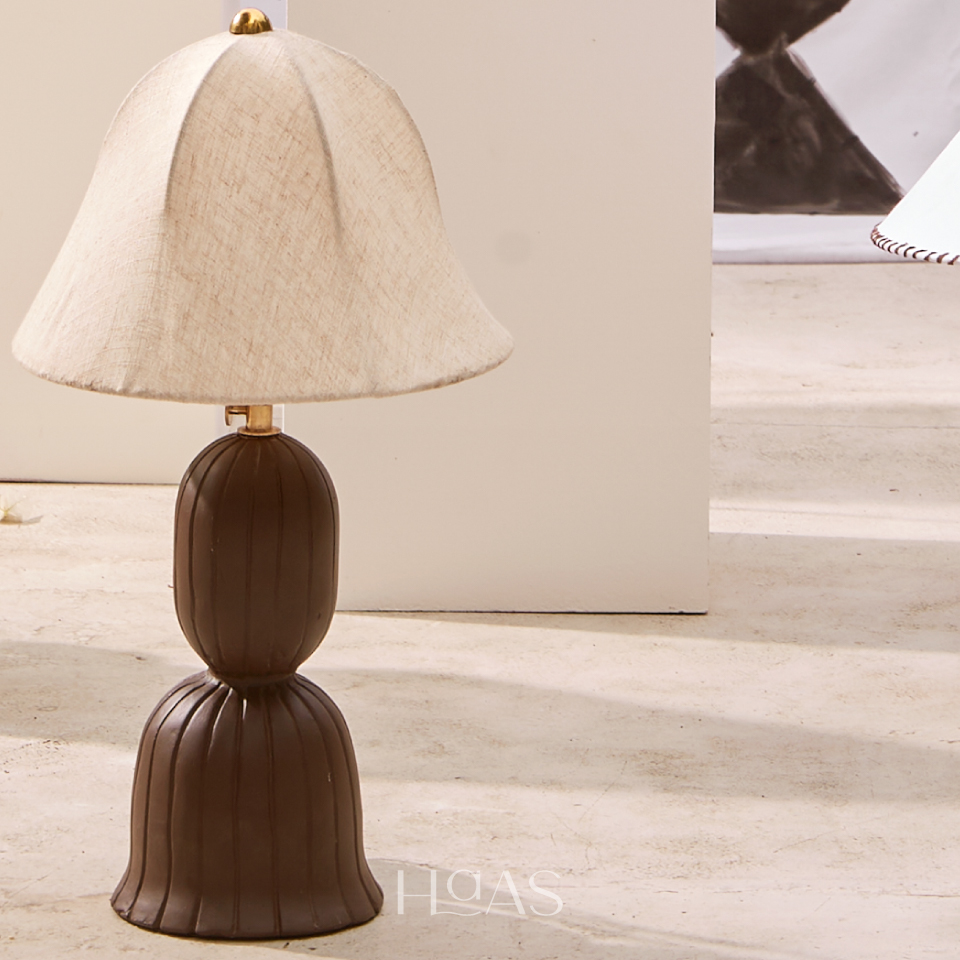
In a bedroom, soft surfaces should dominate: textiles on the bed, a rug underfoot, curtains at the window, upholstered headboard. The hard elements — a stone lamp base, a teak side table, the plaster of the walls — provide the structure that makes the softness feel deliberate rather than excessive.
In a living room, the balance shifts toward an equal weighting. The sofa and rug are soft; the coffee table, floor, and walls are hard. The lounge chair might be one or the other — a rattan chair (hard) beside a linen sofa (soft) provides the contrast that makes both more visually interesting than two soft pieces side by side.
The Contrast Principle
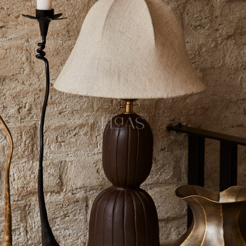
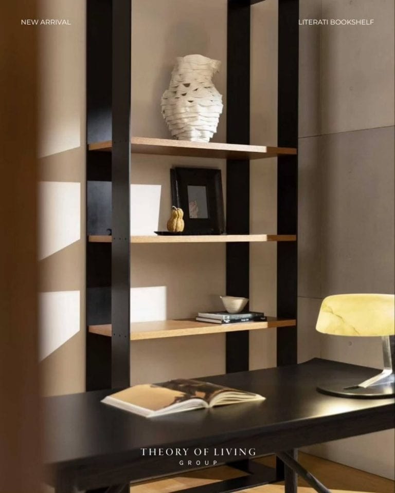
The most effective textural combinations are built on contrast rather than similarity. A lacquered surface against handwoven wool. Smooth honed stone beside rough jute. Matte plaster behind polished brass. The contrast between adjacent textures is what creates visual tension — and visual tension, in the right measure, is what makes a room interesting rather than comfortable but inert.
This is the principle that underlies all effective texture layering: not accumulation but opposition. Not more of the same but more of the different, chosen with restraint and placed with intention.
When to Stop
The most common failure in textural layering is not doing too little — it is doing too much. A room in which every surface is textured, every textile pattern is different, and every object is chosen for its tactile interest produces visual exhaustion rather than richness.
The rule: three to four distinct textures in a room, no more. A rough surface (stone, plaster, jute), a smooth surface (painted wood, lacquer, stone), a soft textile (linen, wool, bouclé), and an accent texture (rattan, metal, ceramic). Beyond four, the composition begins to fragment.
Texture is the difference between a room and a home. Used with care, it turns a correctly designed space into a genuinely inhabitable one — a place that the body knows how to be in, not just the eye how to look at.
Curated Selection
Shop the Look
Texture is what makes a room feel lived in and alive. Layer different rugs, weaves and upholstery — there are no strict rules, only the interplay of touch and tone.
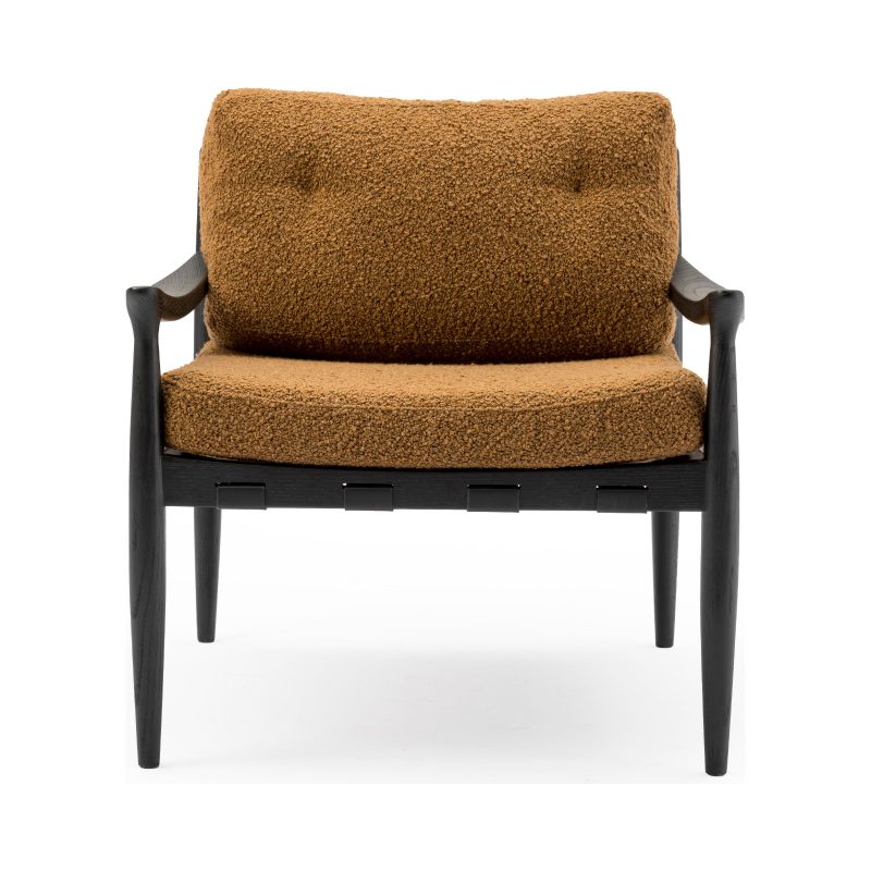

Nerry Armchair
Rp 25.890.000,00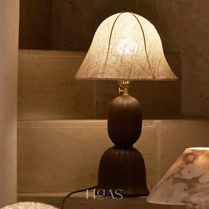
![HAAS Samodra Table Lamp]()
![HAAS Samodra Table Lamp]()
![HAAS Samodra Table Lamp]()
HAAS Samodra Table Lamp
Rp 2.099.900,00