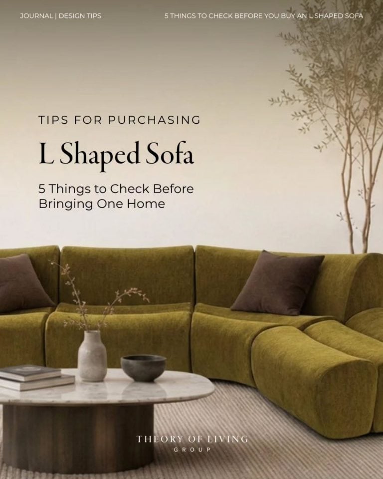
There is a particular kind of room that does not announce itself. You walk in and something settles — the proportions feel right, the materials have weight, nothing competes for your attention. No logomania, no performance. Just quality, expressed quietly.
This is what quiet luxury means in interior design. And in 2026, it is evolving into something more personal and more interesting than the clean-neutrals trend it began as.
What Quiet Luxury Actually Means
Quiet luxury in interiors is the rejection of status signalling through surface-level choices. It is not about stripping everything back to white walls and bare floors. It is about choosing with intent: materials that age gracefully, forms that hold their character over time, a palette that rewards patience rather than immediate impact.
The approach emerged in response to maximalism’s excesses and the social media-driven trend cycle that turned interiors into content rather than homes. Quiet luxury says: the person who lives here has taste, not just a budget.
In 2026, the conversation has deepened. A closely related movement called found luxury has emerged — interiors that layer pieces with history, provenance, and personal meaning alongside new acquisitions. Less perfectly curated, more honestly lived-in. The through-line between both is the same: quality over novelty, restraint over accumulation.
The Palette
Quiet luxury does not wear white. It wears warm cream that shifts to ivory in afternoon light. It wears stone — the kind of taupe that looks brown in one room and grey in another. It wears mineral green, the colour of aged patina on copper, of lichen on limestone.
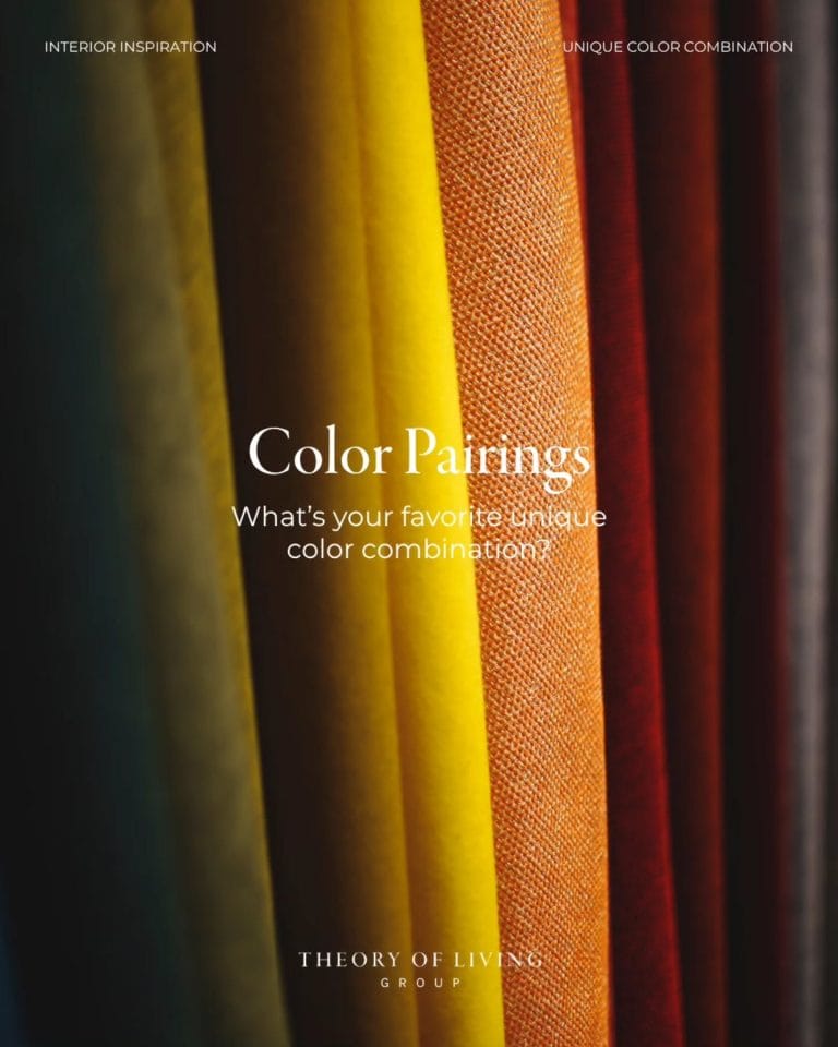
The 2026 palette builds on these complex, in-between tones: warm neutrals that are never quite beige, muted terracotta that is never quite orange, deep earthy tones that read as a colour without trying to be one. These shades interact with light — they move through the day, which is precisely what gives a quiet luxury room its life.
What to avoid: cold grey (it photographs well but feels clinical to live in), stark white (it does not age, it just marks), and any neutral that reads identically at 8am and 8pm.
Materials That Earn Their Place
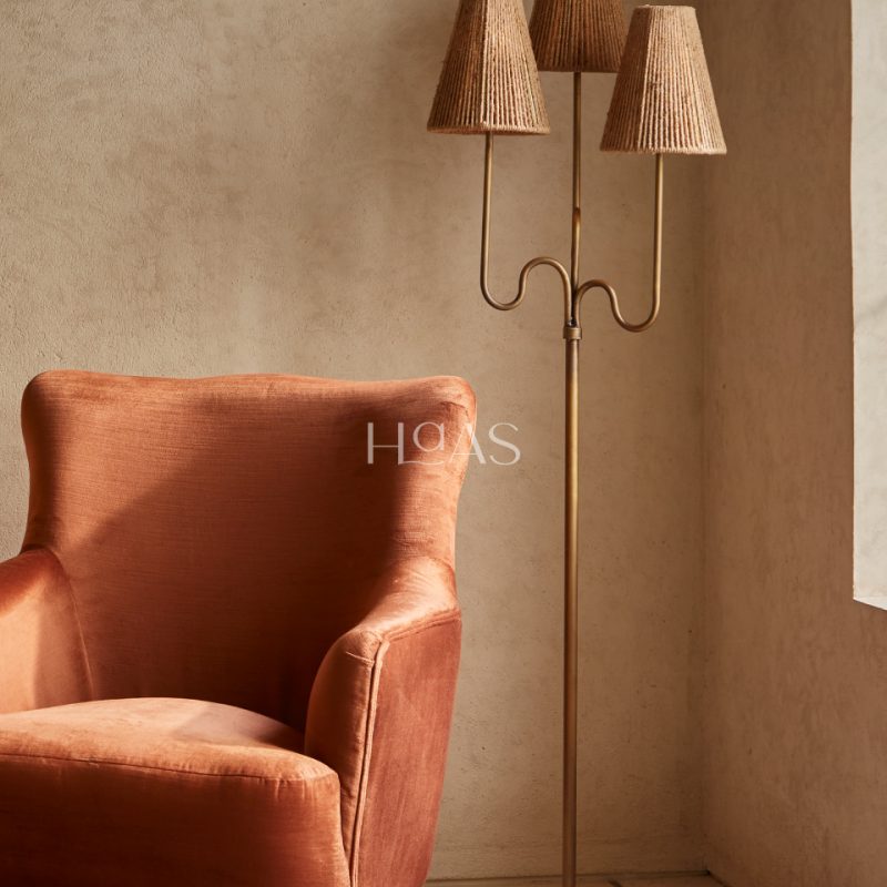
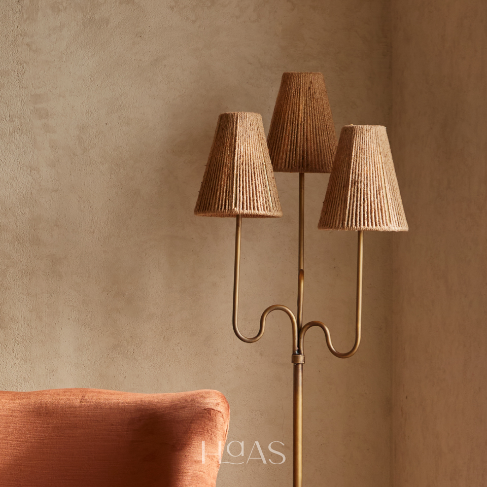
In a quiet luxury interior, every material is chosen because it does something well over time. Linen for upholstery and curtains — it softens with washing, develops character with use, and reads immediately as natural and unhurried. Natural wood for tables and floors — the grain alone provides more visual complexity than any printed pattern. Aged brass for hardware and lighting — unlacquered, left to develop its own patina rather than maintained at a perpetual shine.
Stone is essential but restrained. A honed travertine side table, a marble ledge used as an accent — not a full feature wall. The restraint is, itself, the luxury.
What quiet luxury specifically rejects: high-gloss lacquer on furniture, chrome hardware (too clinical in domestic settings), and fast-furniture wood veneers that photograph as timber and feel like paper.
Lighting as Architecture
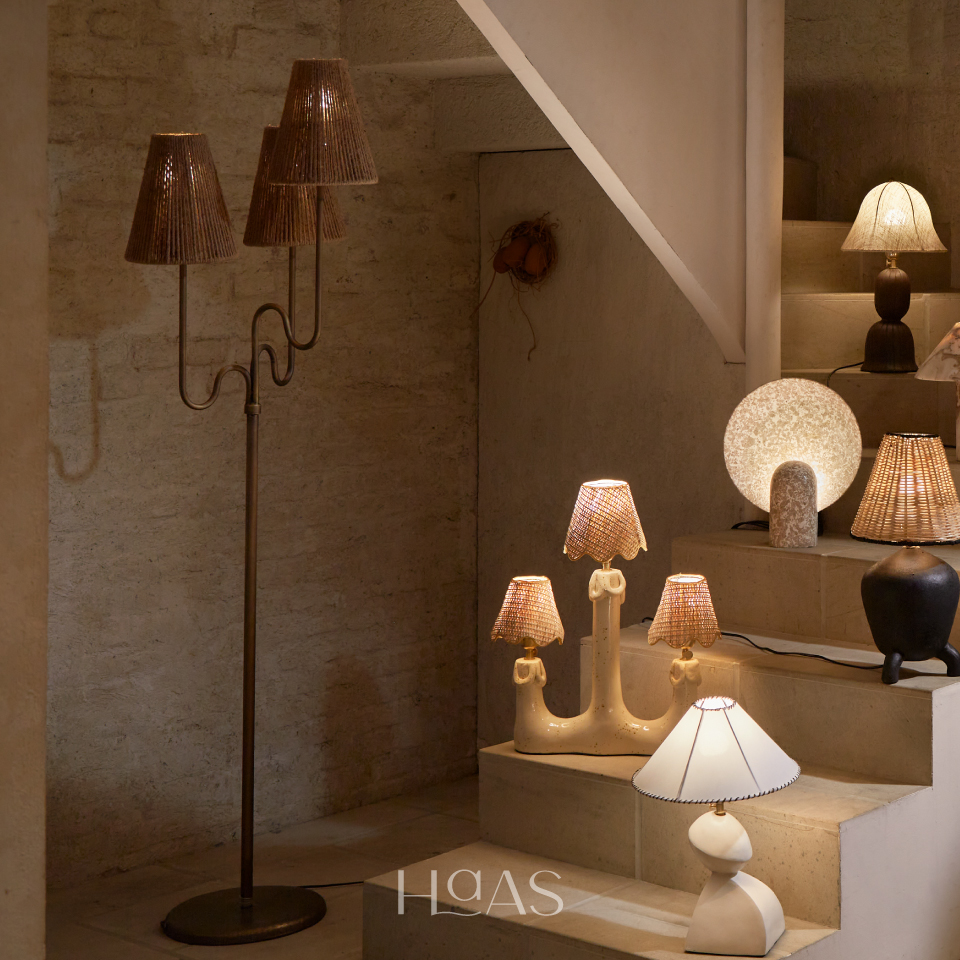
One of the most reliable signals of considered interior design is what you do not see in the lighting. In a quiet luxury room, the ceiling is largely clear of visible fittings. Light comes from architectural integration: concealed coves behind millwork, sconces set flush with plaster, floor lamps positioned to wash walls rather than cast a spotlight into the room.
The goal is ambient illumination — light that fills the space from multiple sources, all at a warm colour temperature (2700K or below), none of them the visual main event.
A candle holder on a sideboard or a table lamp beside a reading chair does double work: it provides light, and it provides an object of quiet beauty when unlit. These are the visible light sources that earn their place in a considered room.
Furniture: Proportions Over Drama
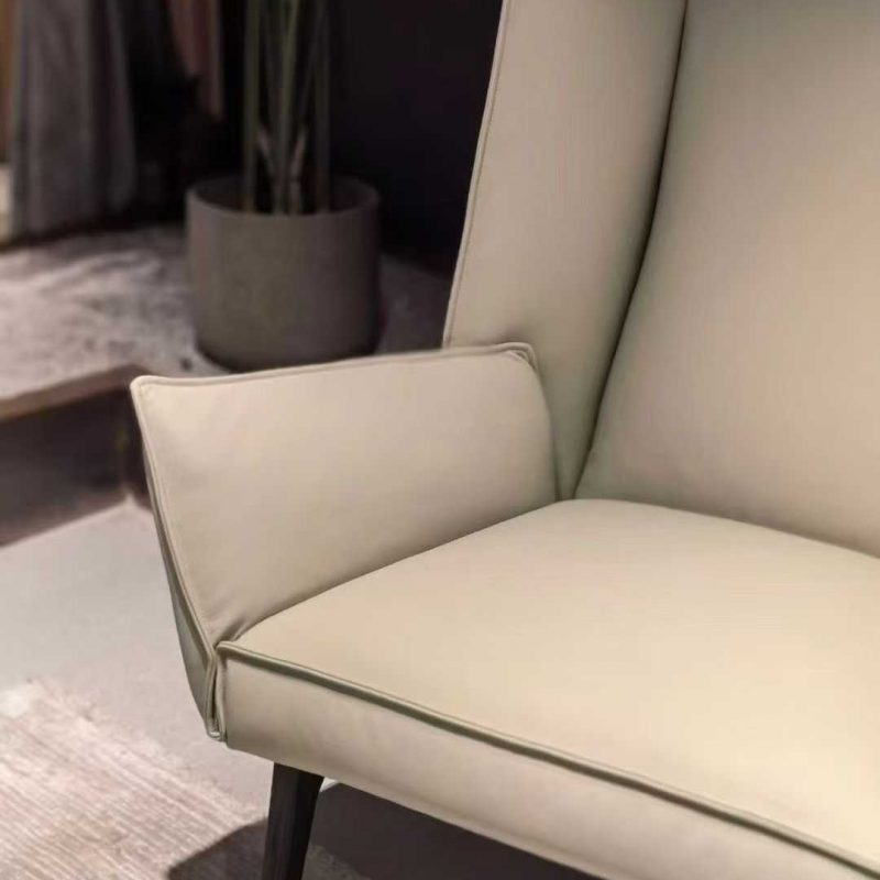
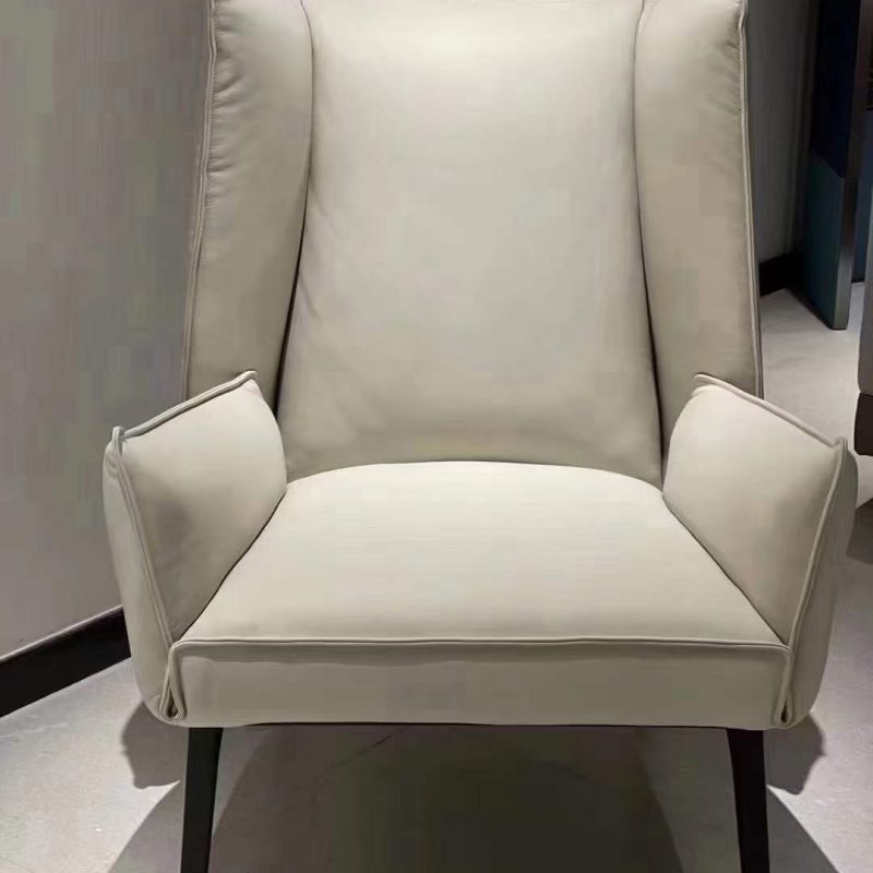
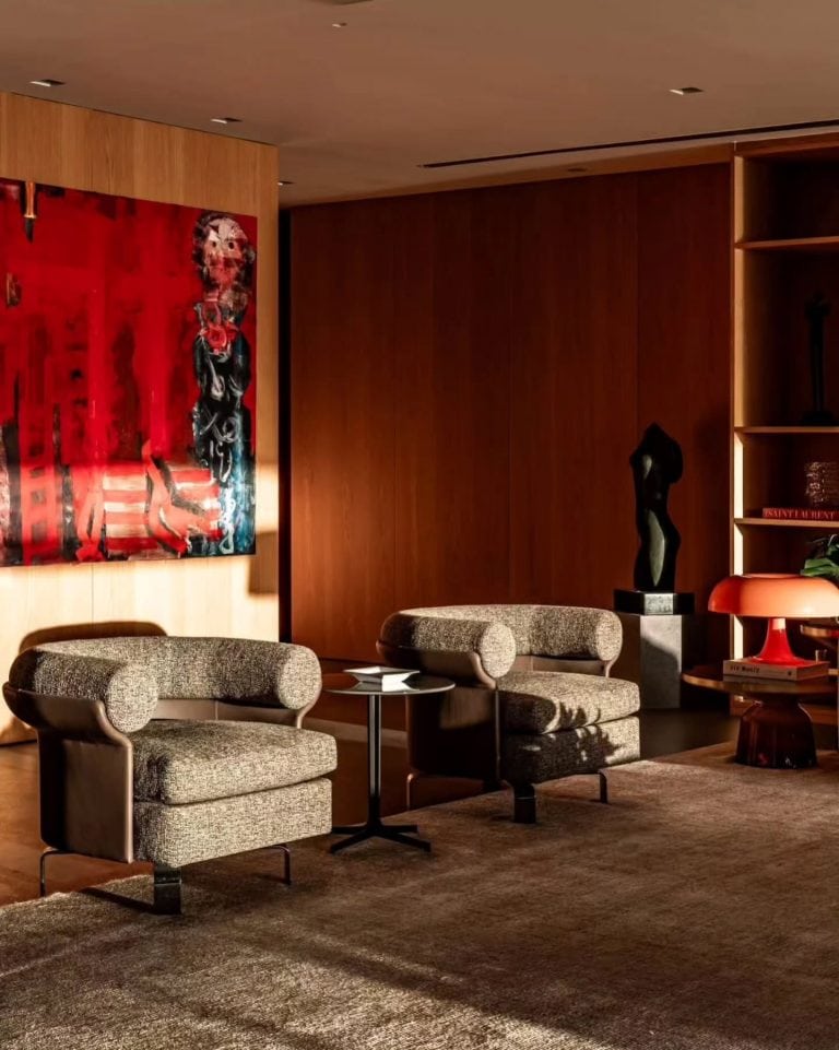
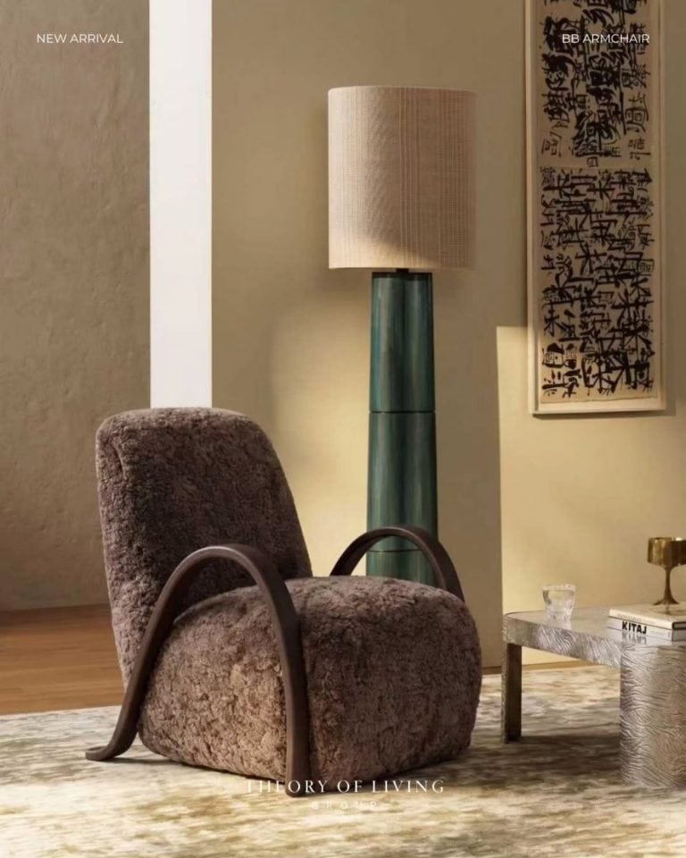
Quiet luxury furniture has generous proportions and does nothing for show. A sofa deep enough to actually recline on. A dining chair that remains comfortable at the end of a long dinner. A lounge chair that accepts you into it rather than perching you uncomfortably on top of it.
The silhouettes are clean but not severe — slightly curved arms, tapered legs, upholstery that is taut rather than overstuffed. Mixing periods is perfectly appropriate; mixing quality levels is not.
The edit is as important as the selection. One extraordinary lounge chair says considerably more than four adequate ones arranged around a room.
Room by Room
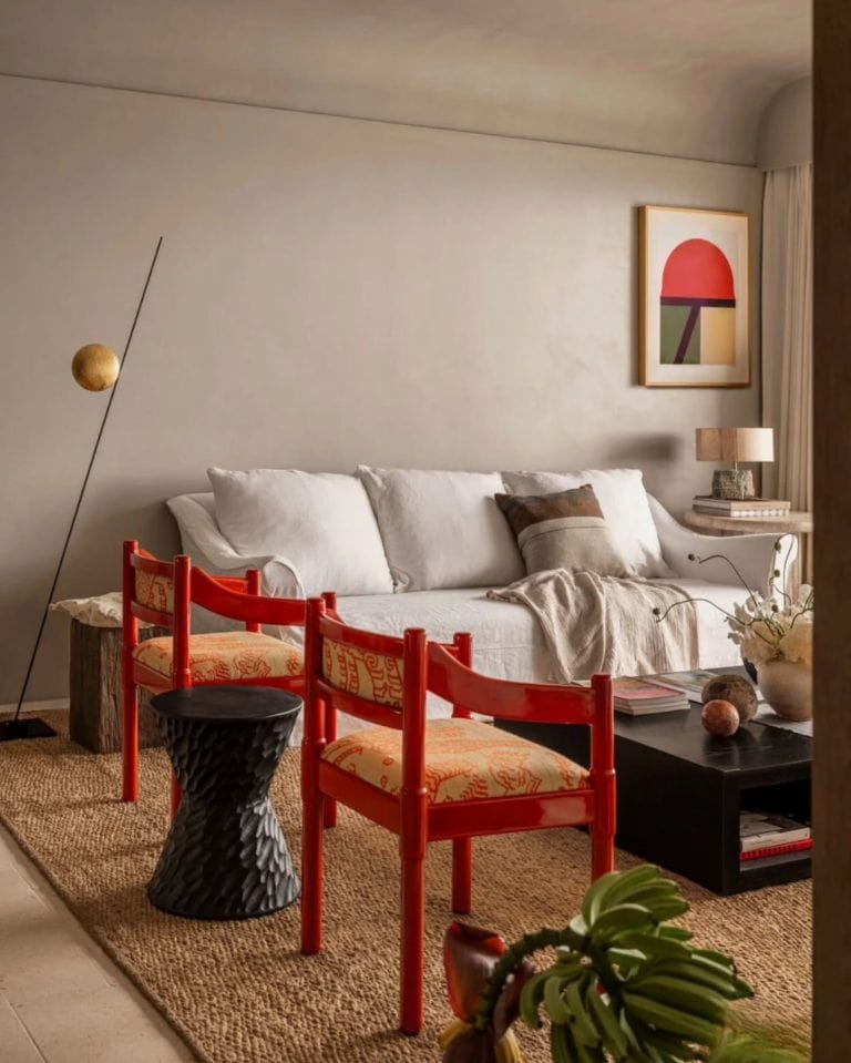
Living room: Anchor with a quality sofa in natural linen or bouclé. Add one statement lounge chair — not matching, but complementary in material and proportion. Keep surfaces clear except for a few considered objects. Let the floor breathe.
Bedroom: Invest in bed linen before any other textile. One excellent throw at the foot of the bed. Two bedside lamps, matching in height. Remove everything from the floor.
Entry: This sets the register for the entire home. One good piece — a console, a chair, a lamp — does it entirely. The entry needs breathing room most of all.
The Theory of Living Approach
Quiet luxury is not achieved by spending more on everything. It is achieved by spending more on less — and then stopping. The decision not to fill a corner is as meaningful as the decision of what to put in it.
Every piece in the Theory of Living collection is chosen with this principle in mind: designed for form and material quality, made to earn a place in a considered home rather than compete for attention within one.
Curated Selection
Shop the Look
Quiet luxury lives in the details — the weight of a velvet cushion, the curve of an arc lamp, a rug that whispers rather than shouts. Curated for those who know.
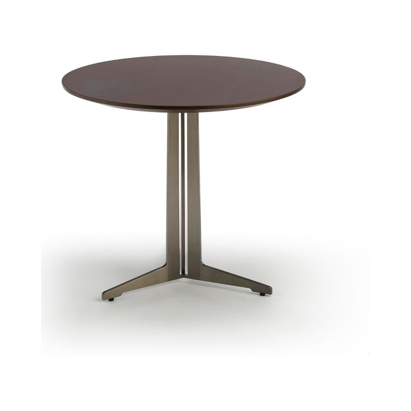

Nora Side Table
Rp 17.890.000,00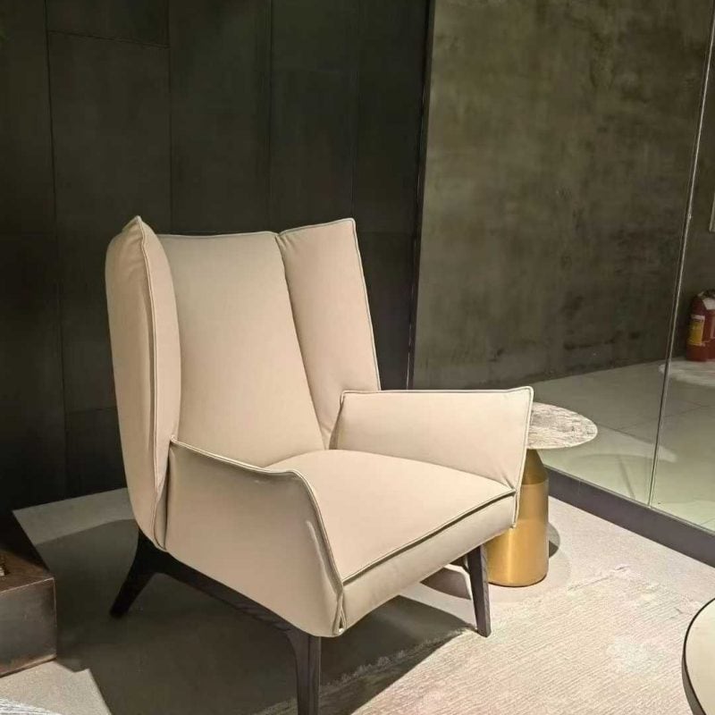
![Terry Armchair]()
![Terry Armchair]()
![Terry Armchair]()
Terry Armchair
Rp 43.490.000,00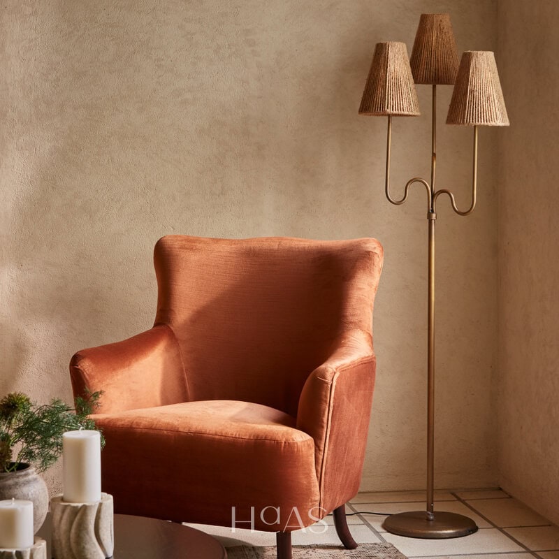
![HAAS Asvara Arc Lamp]()
![HAAS Asvara Arc Lamp]()
![HAAS Asvara Arc Lamp]()
HAAS Asvara Arc Lamp
Rp 4.399.900,00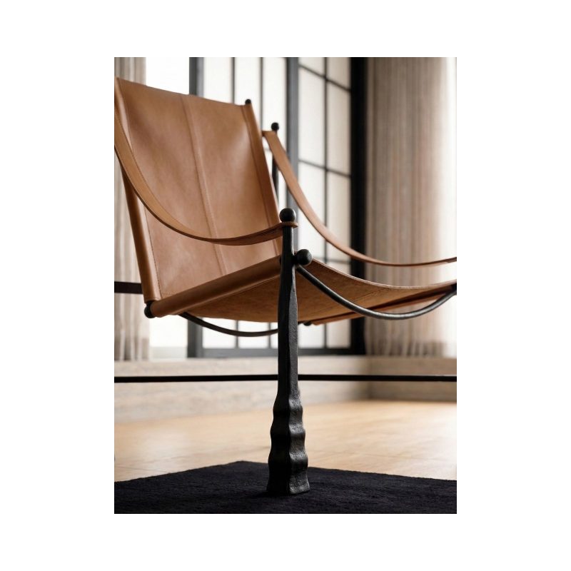
Letion Lounge Chair
Rp 28.890.000,00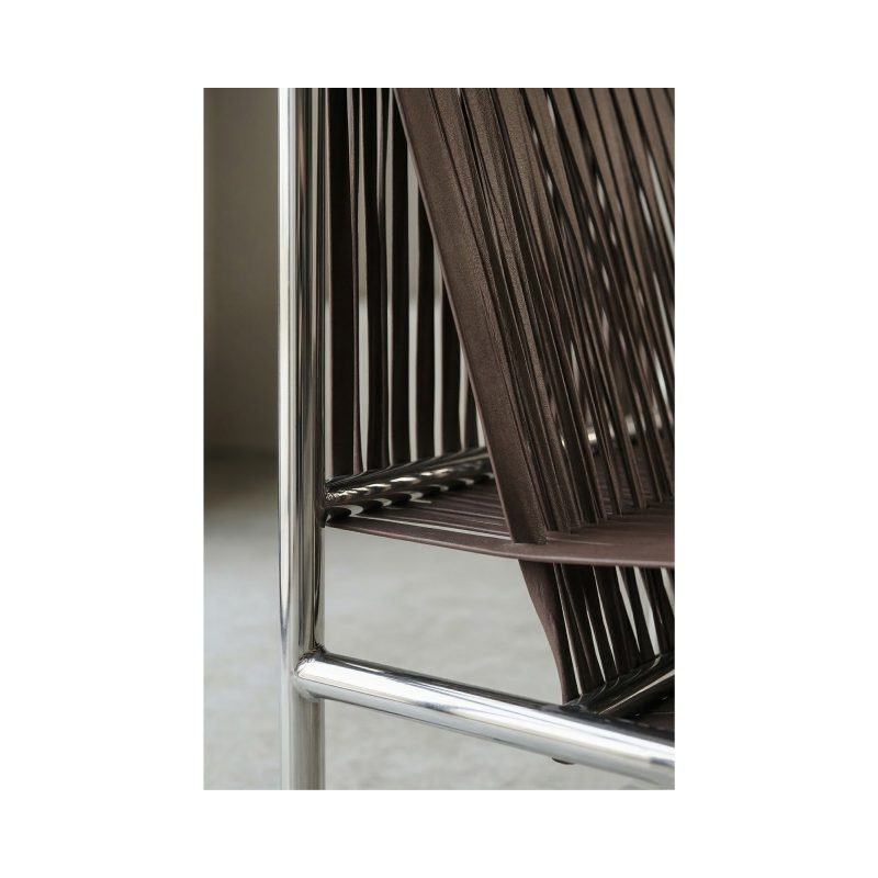
Velluto Lounge Chair
Rp 21.890.000,00