
1. Understanding Color Psychology
Different colors evoke different emotions and moods. For example, blue is often associated with calmness and tranquility, while red can create a sense of energy and passion. Consider the desired atmosphere of the space and choose colors accordingly.
- Red is a color that draws attention and is linked to powerful feelings like love, passion, rage, power, bravery, danger, energizing, and intriguing.
- Orange is a self-assured and entertaining color, and encourages creativity.
- Yellow is bright, lively, and evoke happy feelings.
- Pink is a relaxing color related to femininity, love, kindness.
- Green is a color based on nature, which lies between blue and yellow, and is ideal for energizing and encouraging a healthy state of mind.
- Blue is one of the primary colors and one of the most flexible hues, which can be serene and exciting.
- Purple emanates peaceful, dreamy, and nostalgic feelings. This hue can be charming and bold
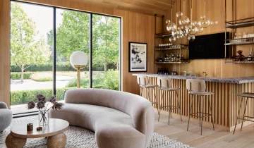
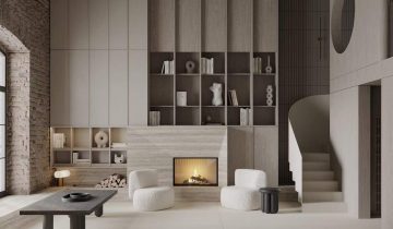
2. Start with Neutral Base

Begin by selecting a neutral color palette for the walls, floors, and larger furniture pieces. Neutrals like white, beige, or gray provide a versatile backdrop and allow other colors to stand out.
3. Create a Color Scheme

Choose a color scheme that consists of a primary color and one or two complementary or contrasting colors.
4. Attention to Color Proportions

Consider the proportions of colors within a space. Use the 60-30-10 rule as a general guideline: 60% of a dominant color, 30% of a secondary color, and 10% of an accent color. This helps create a harmonious and balanced look.
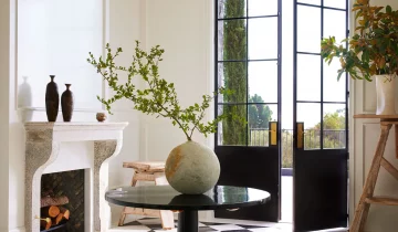
5. Consider the Natural Lighting

Natural light can affect how colors appear in a space. Take into account the direction and intensity of light when selecting colors. Cooler colors work well in rooms with abundant natural light, while warmer colors can add coziness to spaces with limited light.
6. Use Colors to Highlight Features

Colors can be used strategically to emphasize architectural features or focal points. For example, a bold color on an accent wall can draw attention to a particular area, while a contrasting color on trim or moldings can create visual interest.
7. Experiment with Patterns & Textures

Incorporating different textures and patterns can enhance the visual impact of colors. Consider using textiles, wallpapers, rugs, or artwork to introduce additional layers of color and texture.
 No products in the cart.