BLACK

Black is a symbol of protection, power, elegance and sophistication. Black is a powerful and bold color in interior design, but should be used sparingly to avoid overpowering other colors. It’s better suited for rooms where people will sleep or lounge, like a bedroom or theater room. It works well when contrasted with lighter or more vibrant colors such as white, tan, red, green, yellow, and pink.
WHITE

White is a versatile color for interior design. It reflects cleanliness, purity, and perfection while creating a calming and peaceful atmosphere. White makes a space feel open and modern, but too much white can be bland. It’s best to pair it with other colors, such as green, brown, purple, gray, and pink, to keep the design interesting and engaged with guests.
GRAY
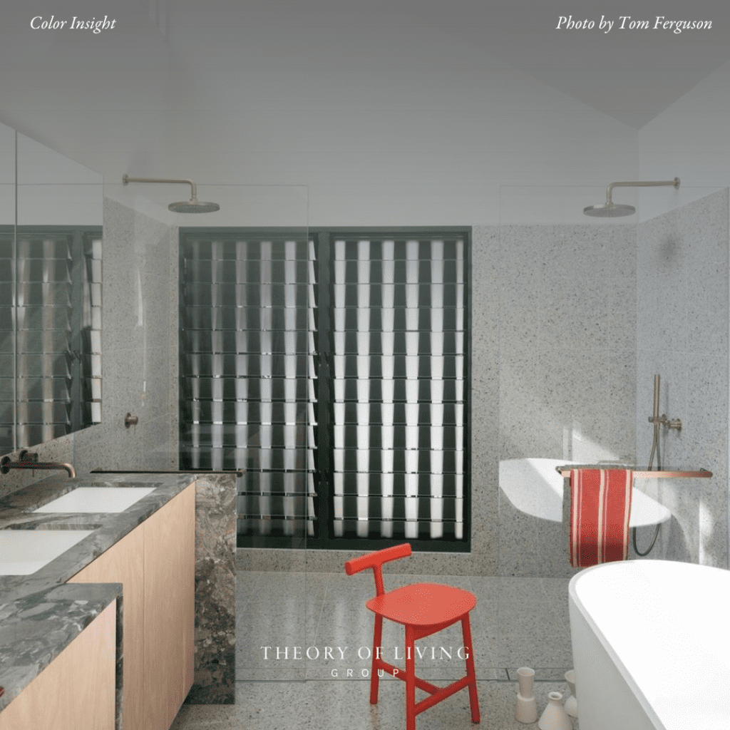
Gray is also a neutral color that symbolizes compromise, control, neutrality, and practicality. It can be seen as modern and elegant, but too much of it can be depressing. Gray is best used to complement other colors and is ideal for simple rooms like a bedroom or bathroom. It works well with white and brown for a calming effect, but can also be paired with vibrant colors like yellow, green, pink, purple, or blue for a more exciting look.
BROWN

Brown is a neutral color symbolizing reliability, stability, honesty, and comfort. It is commonly found in nature, making it familiar and calming. Too much brown can be dull, but it works well in a nature-inspired design. Brown is best paired with white or shades of brown for a relaxing space, but vibrant colors like yellow, red, pink, and green can add excitement. Avoid using brown in productive rooms unless paired with energizing colors.
RED

Red is a vibrant color that represents energy, action, strength, passion, desire, and love. It’s best used in rooms with high energy and activity, such as main rooms in the house. Red can trigger appetite and is often used in restaurants and fast food logos. It’s best paired with neutral colors to tone it down or with green, its complementary color, to create contrast. Using too much red in home design can be overwhelming and associated with anger.
ORANGE

Orange is a bright and vibrant color associated with enthusiasm, optimism, and excitement. It can evoke joy, emotion, and hunger and is great for Halloween or summer parties. It’s best used sparingly in rooms where people gather and pairs well with neutral colors like brown and white, as well as pastel warm colors like yellow and pink. Black or blue provides a good contrast.
YELLOW
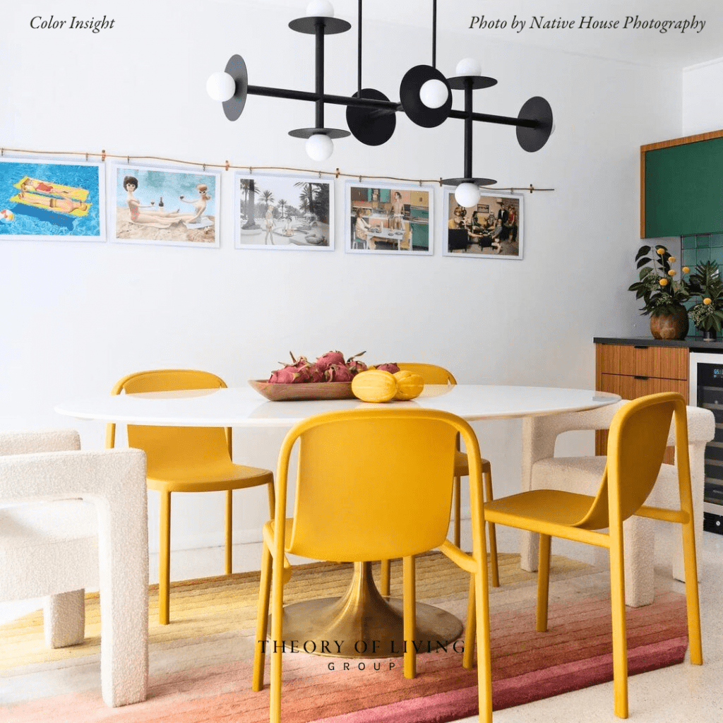
Yellow is associated with happiness, optimism, and positivity, but dull shades can connote sickness or jealousy. When using yellow in room design, it’s best to use it sparingly. It pairs well with darker shades and warm colors.
GREEN

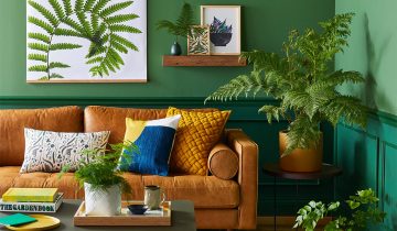
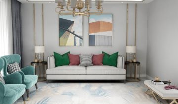
Green is a versatile color in design that represents growth, harmony, health, and safety. It can be used in any room and can be paired with neutral colors or colors near green on the color wheel for playful energy. Despite some negative associations, green is a color that can evoke peace, calmness, and security.
BLUE
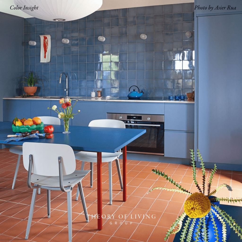
Blue is often associated with a sense of calm, security, trust, loyalty, and responsibility in interior design. This makes it an ideal color choice for bedrooms and bathrooms, providing a tranquil atmosphere. Blue can be paired with a variety of colors, including white, brown, gray, yellow, green, and purple. However, it’s important to avoid overusing blue in office spaces or exercise areas, as it can be linked with negative feelings.
PURPLE

Purple is a hue that can evoke a range of emotions and is appropriate for a variety of environments. Bright purple stimulates creativity, while dark purple exudes elegance and sophistication. Purple paired with light colors feels enchanting, whereas with darker tones, it appears more mature.
PINK

Pink is a versatile color that can represent different emotions and is popular in candy shops, romantic places, and Valentine’s decorations. It adds excitement and energy to a room and is best used in areas other than bedrooms. Pairing it with neutral colors can help balance its vibrancy.

 No products in the cart.