Color is typically the most challenging aspect of a room to get right for interior design enthusiasts. This is due to the fact that colors are unpredictable. There are a plethora of colors to pick from, and they must be combined in the proper proportions. They won’t be able to work together in harmony otherwise. Fortunately, there are a few color principles you can follow to ensure that your colors are always balanced.
But First, let us learn a few things about Color Wheel.
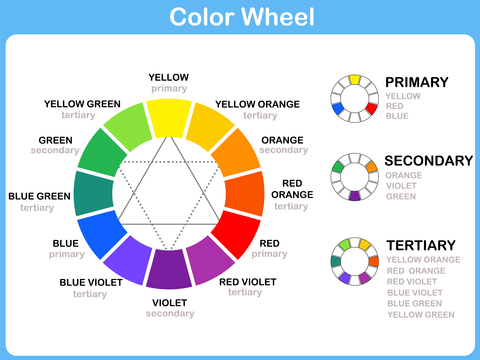
Color Wheel
The color wheel is an excellent tool for matching colors in interior design. Anyone who works with color, such as interior designers, artists, and architects, has learnt how to use the color wheel to figure out what goes with what.
Here are few words you might need to know when learning about color
Hue: a color or shade. The attribute of discernable color i.e. red, blue, yellow etc.
Primary colors: the indispensable base
Red, yellow and blue are the primary colors that, like white, cannot be obtained by mixing other colors. By cons, mixing its three primary colors together, we get black. As their names indicate, they are called primary because they are the first links in the color chain: it is by mixing them that we can produce other colors.
Secondary colors: a productive marriage
The so-called secondary colors result from the mixing of two primary colors.
We obtain as follows:
Green: blue + yellow
Orange: red + yellow
Purple: red + blue
Tertiary colors: three in one
A tertiary color is called a neutral color which contains the three primary colors, without necessarily resulting from the direct mixing of these three colors. A tertiary color is obtained by mixing in equal parts a primary and a secondary color.
Example brown: Orange (secondary color resulting from red + yellow) + blue (primary color)
Complementary colors: chromatic opposites
These are opposite colors on the color circle.
For example :
yellow is complementary to purple
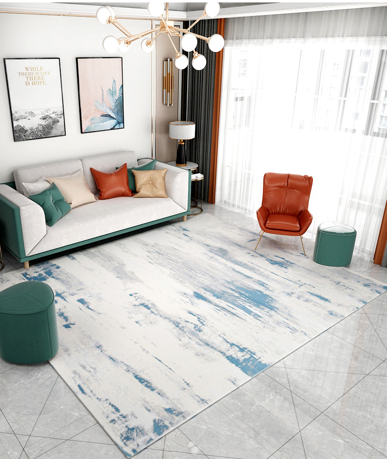
red is complementary to green
blue is complementary to orange
These create brilliant effects and allow to play on the contrasts. Conversely, if we mix these pairs, they cancel each other out and produce neutral colors (yellow + violet = brown …).
Warm, cold and neutral colors
- Warm (or active) colors are the colors that swarm around orange tints such as red, pink, yellow, burgundy, brown, and their shades. They are reassuring, warm and spicy colors that “shrink” the perspective.
- Cold colors (or passive) are used to give an impression of freshness, discretion, and serenity and give the illusion of enlarging the perspective. These tones are grouped around blue, green, purple and their shades.
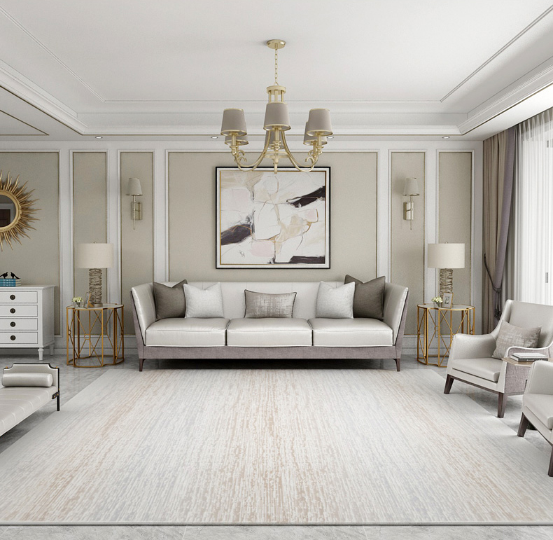
- We speak of neutral tones to qualify the shades from beige, white, black, gray and their nuances.
Tone: The particular quality of brightness, deepness, or hue of a shade of a colour. The general effect of colour or light and shade in a picture. Adding grey to a colour affects the tone
Shade: A colour, especially with regard to how light or dark it is or as distinguished from one nearly like it: “various shades of blue”. Add black to alter the shade of a colour.
Tint: A shade or variety of a colour. Add white to change the tint.
When you follow one of the interior design standards, choosing colors for a well-appointed décor can be simple. Try these time-tested methods will assist you in selecting the best complementing colors for your home.
The 60-30-10 rule
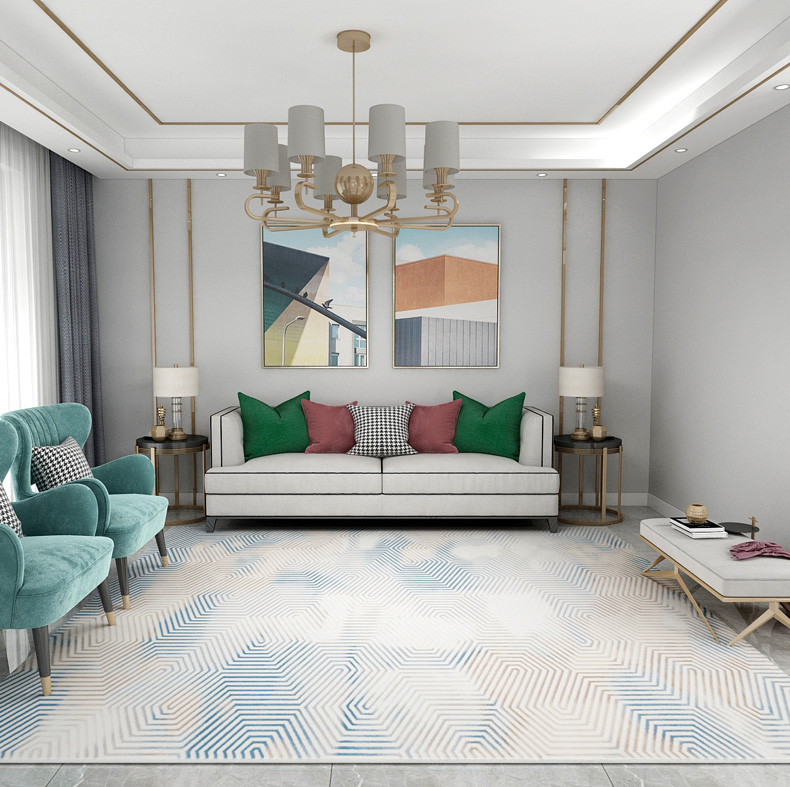
Any interior design enthusiast’s best friend is the 60-30-10 rule. This rule can be used to ensure that your color pallet stays balanced no matter what your personal aesthetic is or how you want your room to look. Three colors will be used in this configuration. The percentages of your design that each will make up are 60, 30 and 10.

The Main Color (60%)
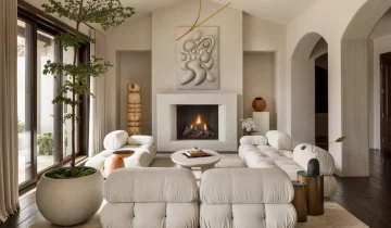
The dominant color should account for 60% of the total color in your room. This usually comprises the wall color, the floor color (carpeting or an area rug), and one or two pieces of furniture. The window treatment, such as curtains or drapes, may also be included. All of these don’t have to be solid colors. Usually, this will be a neutral or some type of subdued hue that can take up a lot of space without feeling overwhelming. But,this main color should always be the most noticeable.
The Secondary Color (30%)
The secondary color will make up 30% of your overall color scheme. The secondary color has half the color saturation of the main color, so it doesn’t compete for attention in your overall design. Instead, it should be in stark contrast to the primary color. The secondary color adds depth and intrigue to your décor by being a different color.
Accent Color (10%)
One-third of the secondary color and one-sixth of the main color will make up the next color. This color will be used as an accent color. Its goal is to make your color scheme more interesting and contrasted. To lure the attention further into the interior design, it should be employed throughout the décor.
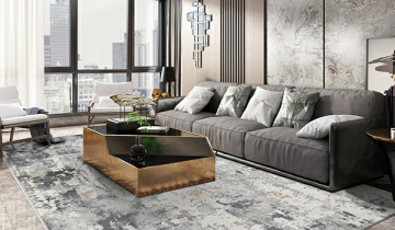
The Analogous Color Scheme
An analogous color scheme might be right for you if you have problems navigating the color wheel. All you have to do for this one is choose a core color and then use the colors on either side of it. Two of the hues will be primary colors, with the third being a combination of the two. Brown, orange, and white, for example, or red, purple, and blue.
Because you’ll be employing three colors in this one, proportion will be important to ensure that the space feels balanced. To keep your proportions in check, you might wish to revisit the 60-30-10 guideline. Remember that another technique to provide visual variety is to use different shades of the same hue. Interestingly, if you don’t like bright colors, you may create a similar color scheme with neutrals. A monochromatic color scheme is what this is known as. All you have to do here is combine black, white, and gray to achieve a sleek, modern design or burgundy, brown, and their shades for a warm color tone.
The Complementary Color Scheme
The complementary color scheme is frequently regarded to be the simplest of all the color guidelines used by interior designers. This is due to the fact that there are only two shades in this color scheme. It uses two hues on the color wheel that are precisely opposite each other, resulting in combinations like blue and orange, yellow and purple, or red and green. These color combinations have a lot of contrast, which means that while they definitely provide a lot of excitement to the room, they’re ultimately best used in small doses. You should think of them as your accent colors and use plenty of neutrals to balance them out and provide a place for the eye to rest.
Summary
To maintain balance every time you design a room you can always rely on the composition of the 60-30-10 rule. This rule can be used to ensure that your color pallet stays balanced no matter what your personal aesthetic is or how you want your room to look. If you’re having problems choosing a color scheme from the color wheel, pick a core color and then use the colors on either side of it. Two of the colors will be primary, while the third will be a mix of the two. If you don’t like bright colors, you can always use neutrals to create a similar color scheme. This is referred to as a monochromatic color palette. To obtain a sleek, modern style, simply combine black, white, and gray, or burgundy, brown, and their shades for a warm color tone.
Tips:
Keep the Color Scheme Flowing
Once you’ve selected a color scheme for the main room in your home, choose one color from it to carry it throughout your home. You can always add other colors to the main color when moving from one room to the next. This strategy will keep your home décor flowing and cohesive without being too similar in every room.
Odd Numbers in Design
The rule of three states that using odd numbers in design results in an interesting and balanced décor. It’s all about using odd numbers, which don’t stop with three and can address any odd numbers to be used in design. However, three seems to be the optimal number when applying the rule to interior design.
Source: sophierobinson.co.uk, interiordesign.lovetoknow.com, mymove.com, pickolor.com
 No products in the cart.